Color Trends 2024
The start of the year means a sudden burst of announcements from across the design industry: Colors of the Year! The Pantone Color of the Year always gets big headlines, but increasingly more paint companies are throwing their hat in the ring with their own annual picks. It’s exciting to see what the industry experts are predicting for the upcoming year and a great inspiration to both designers and clients. So what are this years big color trends?
Grounding Warm Shades
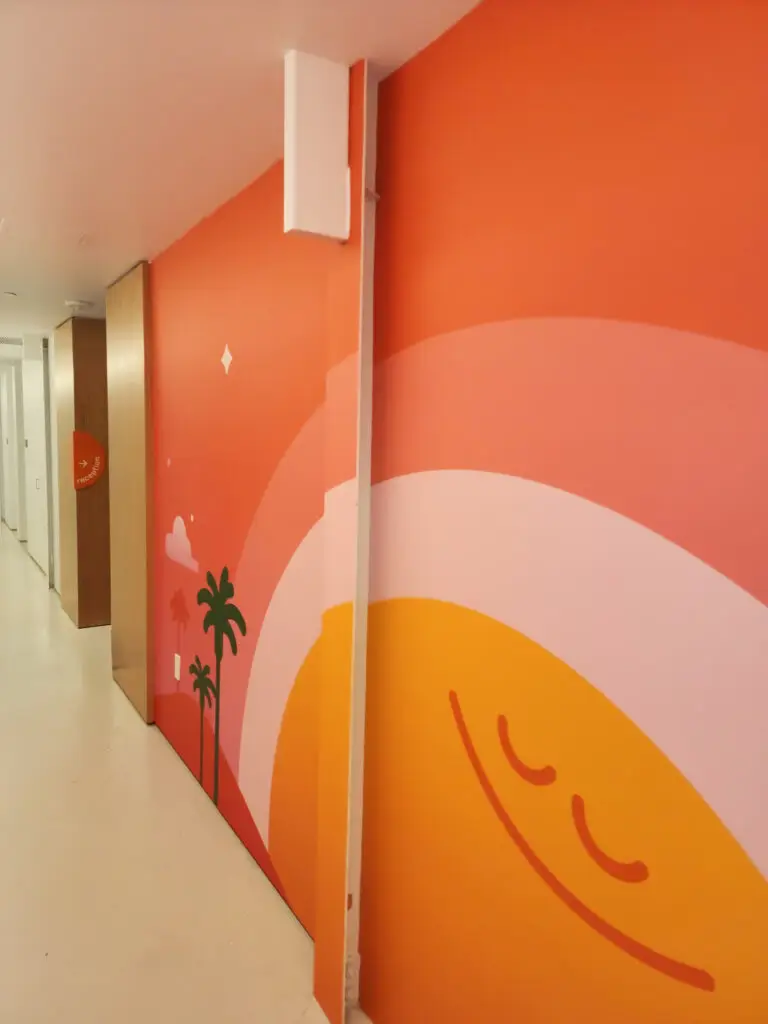
The year always opens with a variety of color trend reports from companies across the design industry, but the clear king of this crowded arena is Pantone and its always much anticipated color of the year. And 2024 has been announced as the year of “Peach Fuzz.” As Pantone Color Institute Director Leatrice Eiseman puts it: “In seeking a hue that echoes our innate yearning for closeness and connection, we chose a color radiant with warmth and modern elegance. A shade that resonates with compassion, offers a tactile embrace, and effortlessly bridges the youthful with the timeless.”
In a world that often feels fraught with uncertainty and unrest, the allure of warm, comforting shades like Peach Fuzz becomes undeniable. Soft warm oranges and reds have a remarkable ability to ground us, offering a sense of stability and reassurance amidst the chaos of modern life. With its soft, inviting tones, Peach Fuzz beckons us to embrace moments of tranquility and reflection, creating a sense of harmony within our surroundings.
Designers and clients alike are increasingly drawn to these grounding warm shades, recognizing the profound impact they can have on the atmosphere of a space. Whether used as a primary color or as accents to complement existing decor, these hues infuse rooms with a sense of coziness and familiarity, transforming them into peaceful havens. In a commercial interior, this translates to decreased stress and cultivates a space to slow down and focus.
In the midst of a tumultuous decade, the allure of warm, grounding shades serves as a beacon of optimism and resilience. They remind us of the enduring power of color to evoke emotion and evoke a sense of belonging, offering a welcome respite from the chaos of the world outside.
Modern Dark Hues
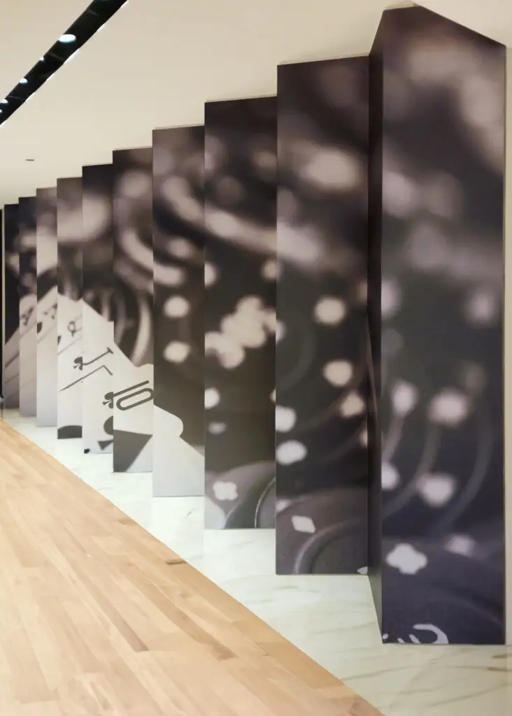
For the particularly bold, another trend growing in popularity is the moody and modern. Designers are increasingly embracing dark hues in their spaces. It marks a growing shift away from the conventional aversion to using black as a dominant color.
While black has long been favored as an accent color, many have shied away from using it as the dominant color in a space. And for good reason, in the wrong space the effect can be claustrophobic. However, when used carefully, these modern dark hues can bring an incredible sense of depth and refinement. They envelop the room in an aura of timeless elegance and tranquility.
By opting for shades like charcoal, slate, or midnight blue, designers can achieve a balance between modernity and sophistication. These hues possess a versatility that allows them to seamlessly integrate into various design styles, whether it be minimalist or urban industrial. Furthermore, they serve as the perfect backdrop for showcasing contrasting elements, such as metallic accents or vibrant furnishings.
Behr has embraced this trend by choosing “Cracked Pepper” as their 2024 Color of the Year. This choice speaks volumes about the shift towards embracing darker tones in interior design. Cracked Pepper embodies a sense of mystery and depth. In commercial spaces, it’s an excellent pick for brands looking to invoke a moodier and more elegant atmosphere.
Timeless and Tranquil Blues
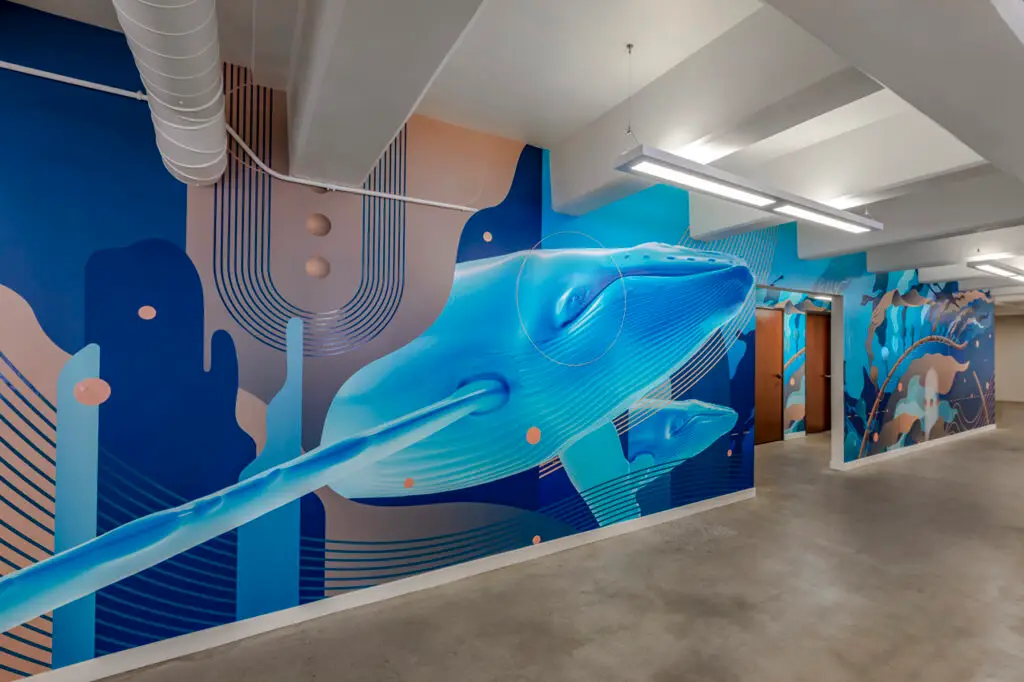
For our final 2024 trend, one timeless color palette continues to reign supreme: soothing blues. This enduring trend reflects a collective yearning for serenity, grounding, and reassurance. Blues possess a remarkable ability to create an atmosphere of calmness and tranquility, making them a favorite among interior designers and clints alike.
The allure of blues lies in their versatility and universal appeal. From crisp cerulean to deep navy, there’s a shade of blue to suit every taste and style preference. Whether used as a dominant color or as subtle accents, blues have the power to transform any space into a sanctuary of solace and relaxation.
In a testament to the popularity of blues, not one, but two renowned paint companies have chosen shades of blue as their Color of the Year for 2024. Benjamin Moore picked “Blue Nova,” a captivating mid-tone blue that strikes the perfect balance between intrigue and reassurance. With its soothing presence, Blue Nova effortlessly elevates any room, bringing a sense of calm sophistication.
Sherwin Williams follows suit with their selection of “Upward,” a lighter shade of blue-gray that creates a sense of tranquility and relaxation. This gentle hue evokes images of clear skies and calm seas, offering a welcome escape from the chaos of everyday life.
As we navigate the complexities of the modern world, the allure of soothing blues remains as strong as ever. These timeless hues serve as a reminder of the enduring power of color to uplift the spirit and soothe the soul. Whether through Benjamin Moore’s Blue Nova or Sherwin Williams’ Upward, embracing soothing blues in our homes allows us to create havens of serenity.
The Joy of Color
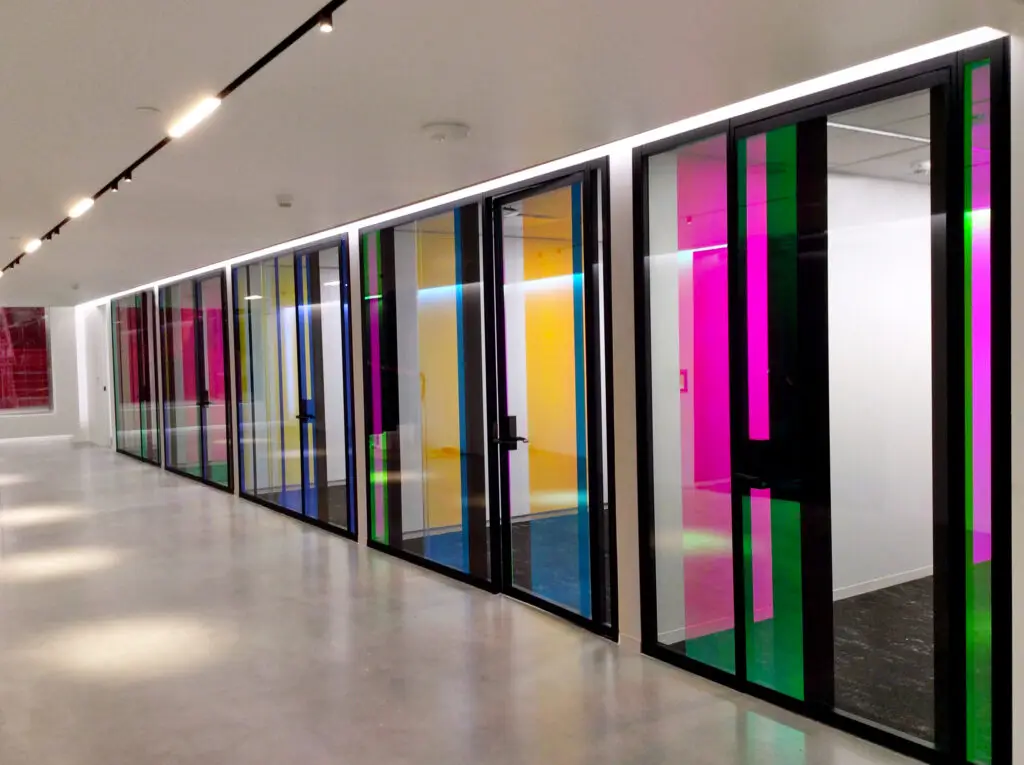
In finishing our blog on 2024’s color trends, one thing is abundantly clear: the power of color to shape our environments and emotional experiences is extraordinary. These color trends provide a starting point for designers and clients to push boundaries and continue to try new things. But never feel the need to be strictly beholden to trends. Rather, take the opportunity to truly consider what type of atmosphere you want to create in a space, and let that guide your design choices.
Recent Posts
Tags
Have Questions?
Aenean imperdiet. Etiam ultricies nisi vel augue. Curabitur ullamcorper ultricies nisi. Nam eget dui. Etiam rhoncus.
