A Deep Dive Into Color Matching
Color is complicated. A single color looks different on a screen vs on paper vs on fabric. The same sample looks different in morning light vs afternoon light. For these reasons and many other complicating factors, color matching is not just a technical process it’s an art. In this blog we take a deep dive into the world of color, explaining the many color systems, when they are used, why it’s important to sample and how to review samples effectively.
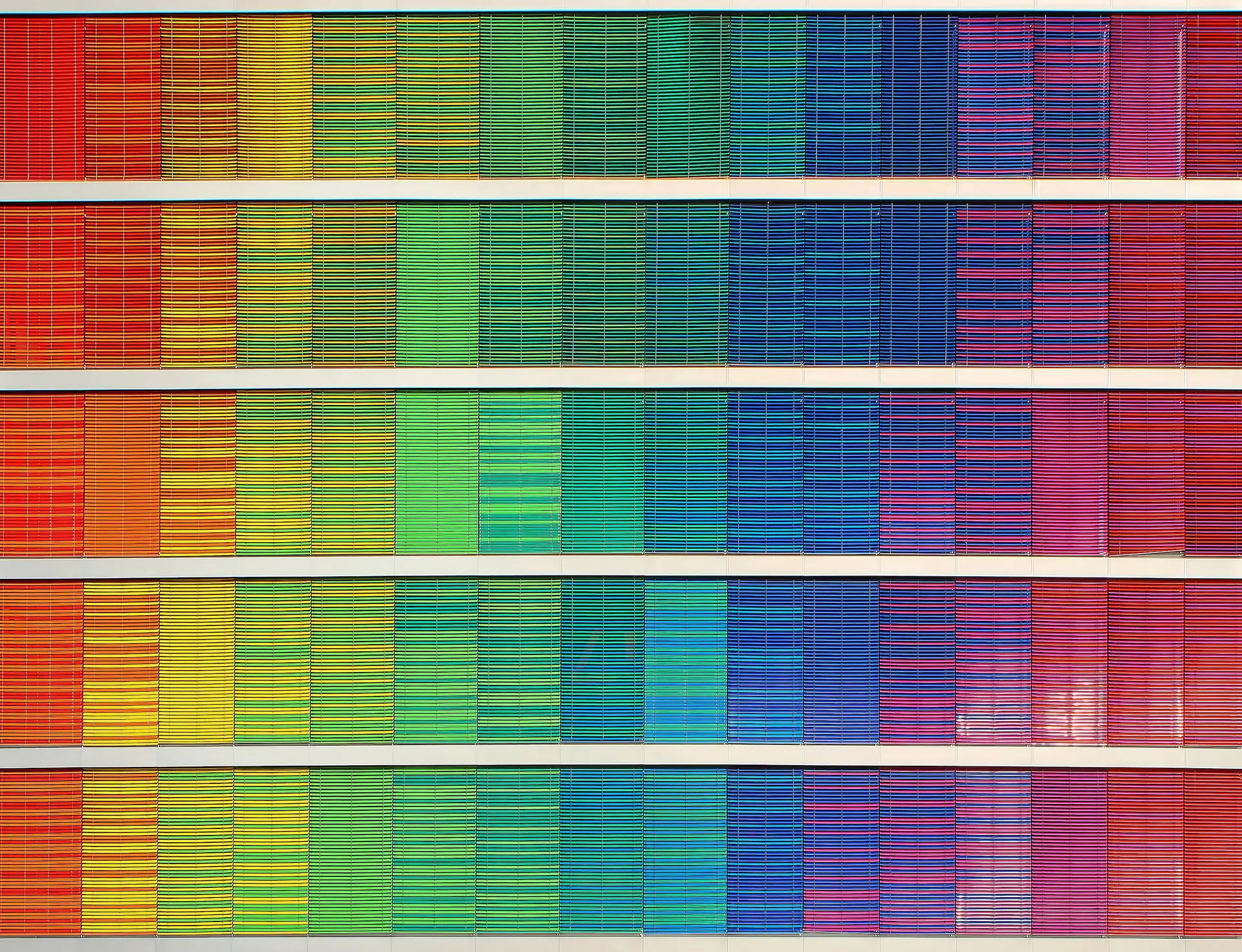
The Color Gamut: An Intro Into The World Of Color
Let’s start with the color gamut. Essentially, the color gamut defines the range of colors that can be accurately represented in a particular circumstance, such as by a printer or computer monitor. Picture it as a meticulously curated palette – a printer and a monitor both have their limitations in the colors they can accurately reproduce. Monitors boast a more extensive color gamut than the color gamut produced by a printer. And both print and digital color gamuts cannot produce all colors that the human eye can perceive. Color perception is complex, and available technology can’t produce all colors in all mediums.
To make the field of colors even trickier, each person perceives colors a little differently to the next. Rember the viral blue or gold dress meme? This is one of the most dramatic examples of how color perception differs person to person. Despite these difficulties, designers, printers, and more need a way to communicate and standardize colors. To do this, there are a variety of color systems, each designed to represent and communicate specific ranges of colors with precision.
RGB: The Digital Colorscape
RGB, an acronym for Red, Green, and Blue, serves as the foundational color system for displays on screens, such as those on computers and phones. Within electronic devices, a light source blends and brings to life the primary colors – red, green, and blue – to produce a staggering array of over 16 million distinct hues.
It is essential, to note that not all RGB colors seamlessly translate to the realm of print. Many of the colors are too vibrant and saturated to be produced with total accuracy in print. While RGB dominates the digital landscape, the print industry employs its own standard in the form of CMYK, a color system we will delve into next.
CMYK: The Color System For Print
CMYYK is the backbone of the print world. CMYK, an acronym for cyan, magenta, yellow, and key (black), operates by mixing these four pigments to create a diverse range of over 16,000 colors. Unlike the RGB system, which relies on light, CMYK’s color spectrum is achieved through a straightforward pigment blending process.
However, it’s important to recognize that the CMYK color system, although extensive, is inherently smaller and less vibrant compared to RGB. The final appearance of colors is influenced significantly by the substrate – the material onto which the image or text is printed. This substrate interaction introduces a layer of complexity, as different materials impact color absorption and reflection differently.
CMYK color codes record what amount of each pigment is used to create a particular color. However, every printer and press have slight variations in how they produce CMYK colors. To create further standardization, spot color systems have become popular in the print industry. The most famous of these is the Pantone Matching System.
Pantone Matching System
Now, let’s shed light on Pantone colors, a stalwart in the quest for color precision within the print industry. Established in 1963, the Pantone Matching System, also called PMS, has become much loved by the design and print industries. It operates by crafting spot colors through the combination of thirteen base pigments, resulting in a meticulously curated and growing palette of over 2000 colors.
What sets Pantone apart from the CMYK system? While CMYK can produce an extensive range of colors, it falls short of replicating certain hues precisely. This is where Pantone steps in with its dedicated color books, serving as a singular reference for printers to achieve precise color matches. In a world where color accuracy is paramount, Pantone emerges as a useful tool for ensuring that the color the client is expecting is the same as what the designer is using and the manufacturer or printer is producing. It provides a reliable and standardized language of color for the print industry.
RAL
Another color system that is gradually becoming more popular in the states after long being recognized in Europe is the RAL color system. Initially crafted in Germany, the RAL system meticulously defines colors for various applications, such as powder coating, varnish, and plastic coloring. With a palette of 2,540 colors, RAL serves as a comprehensive guide for industries seeking precise and standardized color specifications. As it continues to find its footing in the United States, the RAL color system stands as a testament to the global quest for consistent and accurate color representation across diverse materials and applications in the manufacturing world.
Paint Color Systems
Another extremely common type of color system used in the print industry are paint color systems. Already a crucial reference point for interior designers, paint swatches are often submitted for printers to match. Every paint company boasts its own unique collections, each a carefully curated palette of hues. These collections aren’t just about color; they also come with distinct finishes that add another layer of complexity to the selection process. While the CMYK system provides a general representation, the reality is that the exact translation of these shades can vary between brands.
Sampling For Color Matching
Even with all of these color systems available, achieving precise color matching can be a tricky pursuit. The CMYK color variations between printers and presses add layers of complexity to the process. Substrates significantly influence the final appearance of a color, as the material being printed on alters the hues. But wait, there’s more – the lighting environment in which the final product is placed also affects the perception of the color.
To prevent any unwelcome surprises, we take the proactive route by providing color samples on the actual substrate for in-person approval. This hands-on approach ensures that what you see is truly what you get, minimizing the uncertainty and empowering you to make informed.
Our tips for reviewing a color sample given all of these influencing factors? Bring it into the actual space the final material is going to be installed. Tape it up, stand back a couple feet. Consider how the light will change in the environment. Leave it up all day and see how it looks in the morning light versus afternoon brightness versus evening darkness.
Choose Colors with Confidence
With the jargon demystified and MetWest’s tips, we hope you can approach the color matching stage of your next project with confidence.
Recent Posts
Tags
Have Questions?
Aenean imperdiet. Etiam ultricies nisi vel augue. Curabitur ullamcorper ultricies nisi. Nam eget dui. Etiam rhoncus.